Frame Zero
Duration : 6 Weeks
Client : RTM Studio
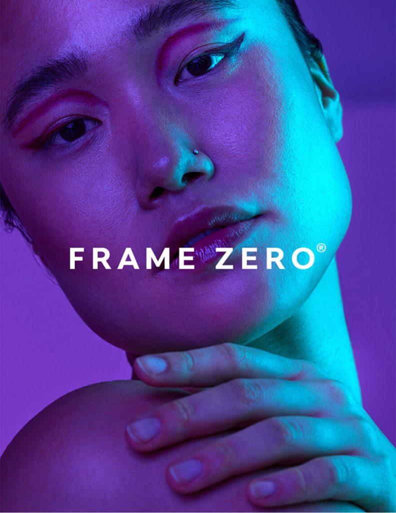
The project draws from a close, intimate portrait framed by saturated violet and cyan lighting. The image emphasizes contrast, softness, and controlled tension between shadow and highlight.
Visual Language
Strong chromatic contrast becomes the primary brand signal. Soft gradients intersect with sharp color boundaries, creating a balance between calm and intensity. The composition feels restrained yet expressive.
Typography & Form
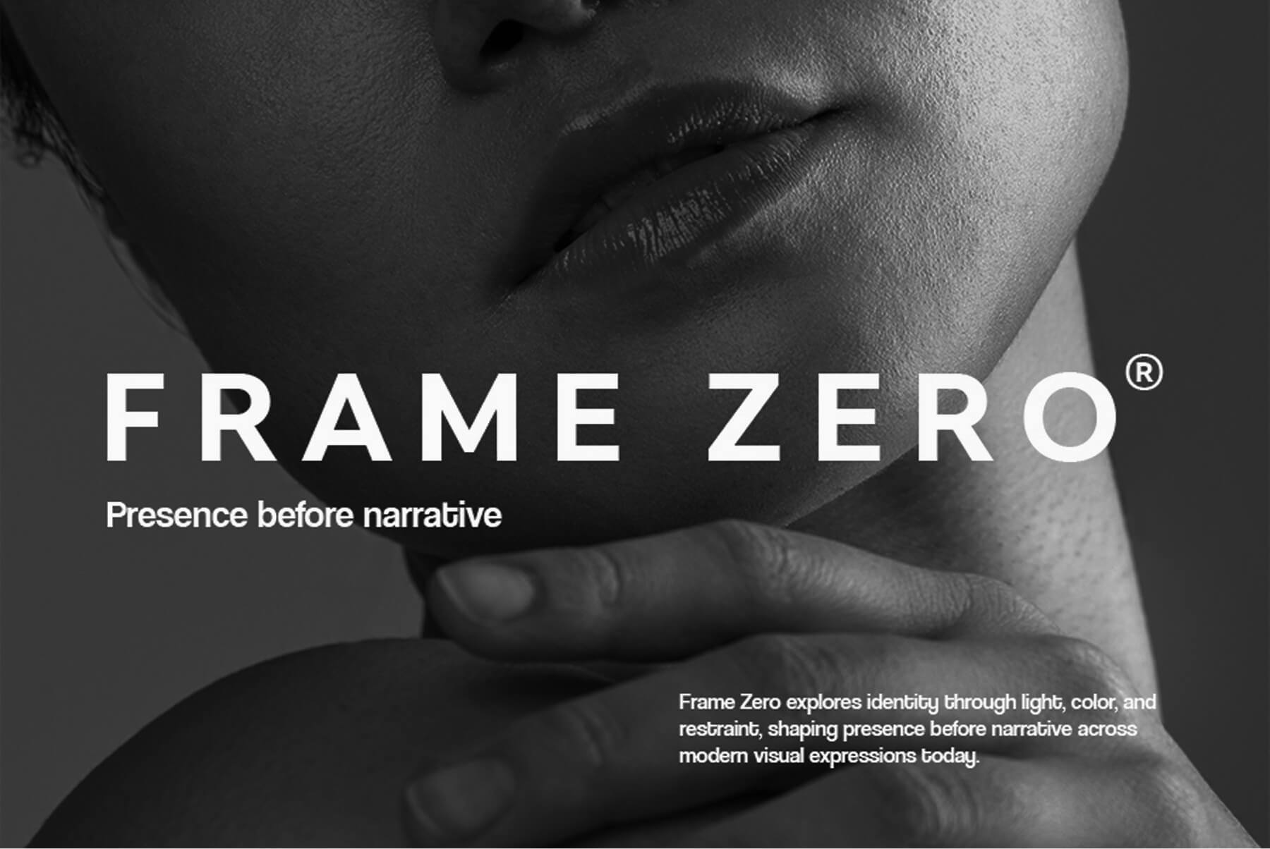
Typography is minimal and secondary, designed to support imagery without competing for attention. Layouts favor negative space, allowing color and facial framing to establish hierarchy and rhythm.
Design Direction
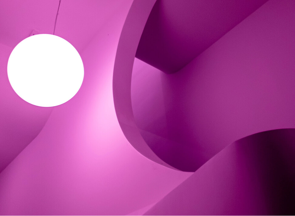
The direction focuses on stillness and focus. Close framing, limited palettes, and deliberate lighting create a visual identity that feels introspective, modern, and intentionally quiet.
Result
Frame Zero results in a branding system rooted in mood rather than symbols. The identity remains flexible across applications while maintaining a consistent sense of tone, depth, and visual restraint.
Frame Zero explores identity at its most reduced state —where color, light, and form define presence before narrative. The brand begins visually, not verbally, allowing atmosphere to lead recognition.
")
")
[ TESTIMONIALS ]
Shared Feedback
VISUAL SYSTEMS
BRANDING
INTERFACES
DIGITAL DESIGN
VISUAL IDENTITY
TYPOGRAPHY
DIGITAL FORM
WEB LAYOUTS
[ FAQ ]
frequently asked question
My practice centers on branding, visual identity, web design, and creative direction, with emphasis on structure, clarity, and long-term visual systems.
My practice centers on branding, visual identity, web design, and creative direction, with emphasis on structure, clarity, and long-term visual systems.
My practice centers on branding, visual identity, web design, and creative direction, with emphasis on structure, clarity, and long-term visual systems.
My practice centers on branding, visual identity, web design, and creative direction, with emphasis on structure, clarity, and long-term visual systems.
My practice centers on branding, visual identity, web design, and creative direction, with emphasis on structure, clarity, and long-term visual systems.
Common questions about my design practice, process, and working approach.